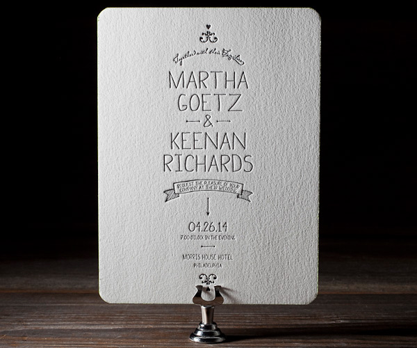
No, I’m not talking about the first impression you had of your fiance. (Although those usually make for pretty good stories!) I’m talking about the first impression your guests will have of your wedding. And it comes way before your wedding actually happens. I’m talking about the invitations!
Invitations are the first thing your guests see to give them an idea of what your wedding celebration will be like. Which means it’s important to have an invitation that truly reflects not only the personalities of you and your fiance, but also the personality of your wedding! So whether you’re designing them yourself or having them custom designed, here are a few things that really contribute to the feel of the invitation:
- Colors– This is probably the most obvious, and I talk all about choosing your wedding colors here. So I won’t go into much detail for this one, but remember to keep accent colors in mind, and use enough contrast so that the different invitation elements don’t all blend together!
- Fonts– The fonts you choose play a HUGE role in what kind of an impression your invitation will give, maybe even more-so than the colors. (Here is where my graphic design background comes in and geeks out on you.) Without getting into a deep conversation about all things typography (I LOVE typography, in case you were wondering), just take notice of how different fonts express different feelings and styles. If you’re having a very formal wedding, you’re probably going to want to stay away from block letters. And vice versa, if you’re having more of a casual, simple affair, using an ornate script probably isn’t the best way to go. Even if they are really great fonts, if they don’t match anything else going in your wedding, it’s best to try and find something better suited! I could also get into fonts to stay away from (cough*zapfino*cough), but I’ll leave it at this suggestion: If you’re designing your own invites, try to steer away from fonts that already come with your computer. If you’re having them created for you, your designer should already know better.
- Paper Type– Thick? Textured? Blush colored? Shimmery? Matte? Don’t think you’re stuck with just a plain card-stock! There are lots of pretty and fun paper choices that can give your invitations a unique spin. One tip, though. If you’re using paper that isn’t white, definitely do a test print (if you’re making them yourself) or request a sample (if they’re being done for you), because colors can appear different on paper that’s not white.
- Details and Accents– These are always my favorite part about invitations :) If you can incorporate a little hint of what’s to come, it’s that much more exciting to get an invitation! Do you have a country theme? Tie a twine bow around it. Keeping it classy? Using a calligrapher to address the envelopes will definitely give that feeling. Want it simple and clean? Leave lots of white space but include a picture of the two of you for personalization. Using feathers as a decoration in your wedding? Add a feather graphic into the overall design. Going for elegance? Having letterpress invitations can be a very sophisticated touch. Do you love lace? Add in lace lining to your envelopes. Those are just a few really random ideas lol. The possibilities are endless! But the best kind of invitations, in my opinion, are the ones that let your personalities shine :)
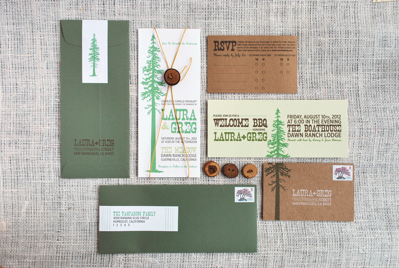
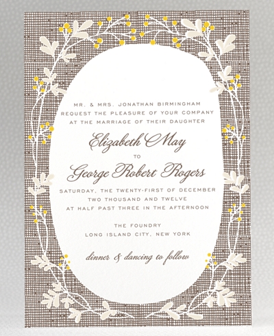
Here are a few charming invites to pique your creativity. Notice how they all have a very different yet very definite vibe! Don’t you feel like you know what the wedding is all about, just from the invite? Love that.
I’m a big fan of this design by Bella Figura. Clean with lots of white space, but the fonts and layout are so fun!
How great are those little wooden buttons?! This design by Three Little Words definitely tells you what this wedding will be like.
This cute little invite by Hello Lucky is simple yet full of personality.
Pica Press did an excellent job creating this invite. Who’s ready for a BBQ now!?
Another one by Three Little Words. I love the playful yet elegant feeling of this suite.
Lastly here’s a fun one by Grapevine Paperie. Perfect for an ocean themed wedding, don’t you think?
Happy Wednesday!
